The Color System
Primary Color
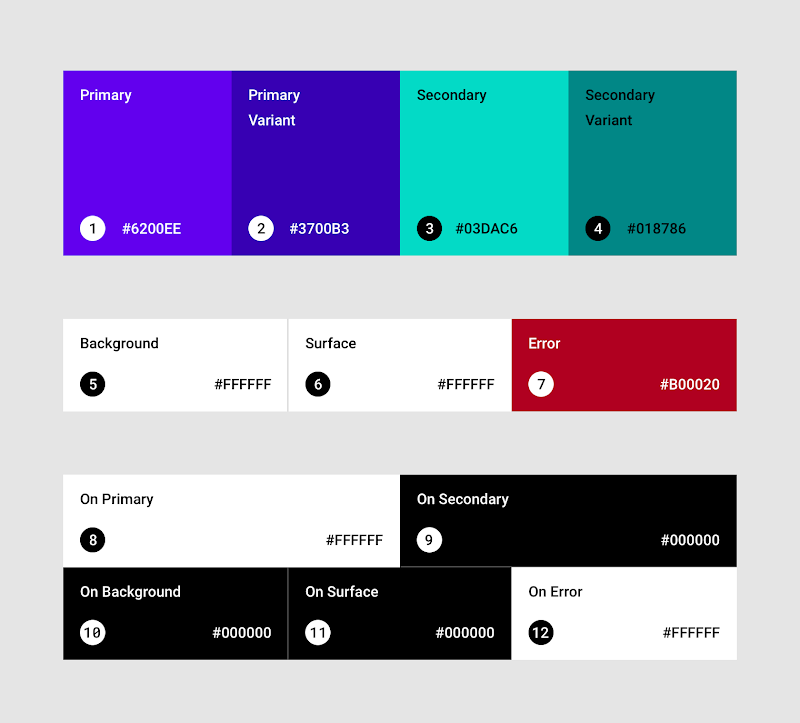
A primary color is the color displayed most frequently across your app’s screens and components.
If you don’t have a secondary color, your primary color can also be used to accent elements.
Dark and light primary variants
You can make a color theme for your app using your primary color, as well as dark and light primary variants.
Distinguish UI elements
To create contrast between UI elements, such as distinguishing a top app bar from a system bar, you can use light or dark variants of your primary color on each elements. You can also use variants to distinguish elements within a component, such different variants used on a floating action button container, and the icon within it.
Secondary Color
A secondary color provides more ways to accent and distinguish your product. Having a secondary color is optional, and should be applied sparingly to accent select parts of your UI.
Secondary colors are best for:
- Floating action buttons
- Selection controls, like sliders and switches
- Highlighting selected text
- Progress bars
- Links and headlines
- Dark and light secondary variants
- Just like the primary color, your secondary color can have dark and light variants. You can make a color theme by using your primary color, secondary color, and dark and light variants of each color.
 Team
Team Product
 Announcements
 Frequently Asked Question
 Expectations
 Execution Strategy
 Management
 Performance-Based Compensation
 Benefits
 Learning & Training
 Policies & Legal
 Onboarding
 General Performance Review
 Application Data
 Open Positions
 Designer Interview Process
 Developer Interview Process
 Researcher Interview Process
 QA/QC Engineer Interview Process
 Onboarding Training
 Open Source Contribution
 Students & New Graduates
 Engineer Onboarding
 Tech Stack
 Front-End Stack
 Back-End Stack
 Velocity of Work
 Performance Review
 Code Styles
 Code Review
 Quality Control & Testing
 DevOps & Site Reliability
 Colors
 Fonts
Fonts Style Guides
 Roadmap